As a member of the American Marketing Association, I'm almost
embarrassed to tell potential employers about the GVSU AMA site's existence.
The only change it has made over the course of the last two years is the
names of the executive officers. The original site was done just to put
something on the web. It isn't enough just to have a website. It has to
have a purpose, an element of usability, and a sense of aesthetics. I've
decided to provide some guidance as to how to improve the site and make
it a bit more useable.
Purpose and Access to Information
The site has to be a source of information or brochure
that is useable for three groups.
Current members
Potential members
Potential employers
Current members need to be able to access the site
for information on events, access to other members, and job posting information.
Potential members: need to see the organization's
possibilities.
Potential employers: need to be able to post jobs
and see members as credible potential hires.
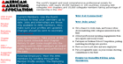
To accomplish this I moved the navigational bars to the
top right portion of the page where they are easier to find. I also created
some text, offering direction for each of the three groups. The table
uses contrasting colors and stands out as the most visible element of
the page. This immediately addresses the site's problem of being usable.
Current Members
Attract New Members
Potential Employers
Design
There were four elements I wanted to be sure to address
when evaluating design: contrast, repition, alignment, and proximity.
The major changes I made concerned contrast and alignment.
The original page used four basic colors, gray, black, and
red. It used one table bookended by two layers to try and link everything
together.
I started by addressing the contrast. Instead of making
the colors and tables fight against each other, I attempted to make them
work cohesively. I used one table for the head banner, one for the text
and links and then one layer to single out unrelated information. I used
the color combination of a dark blue with a peach in order to bring attention
to the middle of the page, but primarily because they worked well with
the color combinations of my links.
The second major issue was alignment. The new site's focus
leaned more toward building strong visual lines. I eliminated most of
the centered text and moved it to left justified. This helped to prevent
the trapping of white space.
Notice
the alignment and color changes improving the contast in styles between
the old and new site!
Organization
With implementation of the new page, a user no longer
has to scroll all the way to the bottom of the page to find relevant information.
Everything is laid out in a logical order. There are no huge image files
to download, so the site loads quickly. Finally, the look is more consistent.
It's almost a cookie cutter design, but it's something users can quickly
become familiar with and view more effectively.
Aesthetics
The top banner takes up the entire screen making
users who do not like to scroll very unhappy. If the banner was aesthetic
enough to stand alone, perhaps the AMA could get away with it. As it stands,
the spotty gifs don't add much to the enjoyment of the user.
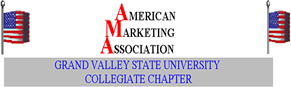
The use of flags has strong connotations. The groups
needs to appeal to international organizations as well as exchange students
might see this display as threatening. The AMA graphic looks as if it's
been stretched and has lost its sharpness.
I kept the white background, just because it made the links
easier to use and the page a bit friendlier. I also incorporated many
of the same fonts (such as Broadway and Verdana) because I liked the look
and they were readable in many browsers. I moved the logos to the bottom
of the page because the users know where they've clicked. It's not a page
you would find in a general search.
The biggest thing was giving the page a more professional
look. I wanted to create a balanced design with no more than two families
of fonts, a complimenting color scheme, and banners that alert the reader
to what's important.
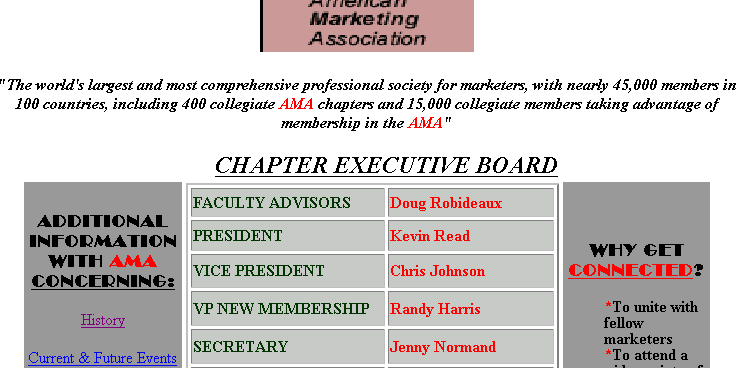
The old site used this banner with flags that took up the entire screen.
Text
I made some subtle changes in the text to make the tone
a bit more professional and not quite as hashed. It seems like the old
text was copied and pasted from the national site. I wanted to give it
a more personal feel. I chose bulleted lists in a layer to create organization;
setting the width by pixels so it will appear consistent on most screens
or browsers.
I would make the suggestion of moving the table with the
members names into a more useable format with it's own page called member
profiles. This way each member can customize what information they would
like available on the web.
In writing the new text I made sure to keep my word count
minimal and used concise, objective language.