Publishing Companies
Overview
Home :: Back to TopThere are thousands of website genres on the World Wide Web today, news, sports teams, personal pages, school sites, and special interest sites – just to name a few. I chose to analyze special interest sites, specifically publishing companies. I chose Scholastic as the primary site to analyze and made comparisons to two other major book printing and publishing companies – McGraw-Hill and Random House. Since McGraw-Hill is a huge company that owns several companies, I focused my analysis on the Education division of McGraw-Hill, since its mission closely reflects that of Scholastic and Random House.
Writers & Developers
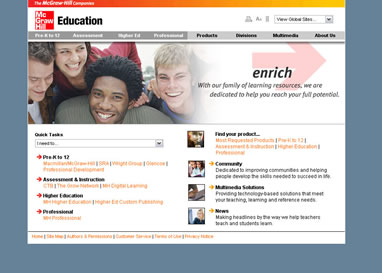
McGraw-Hill
McGraw-Hill has an “invisible” web team for their website, which means visitors of the site cannot find the names of those who maintain the website. There are only two methods of contacting the web team – email and by mail. Their email is the generic webmaster@mcgraw-hill.com . There is no attribution to the writers or content contributors of the website because there is very little content submitted by other staff members.
There are many feature that cue visitors into the organization's identity, purpose, and mission. There are several photos depicting happy people of all ages. Since McGraw-Hill is geared more towards publishing textbooks than leisure reading books, the photos reflect doctors, families, and students all excited to be learning. In addition to the photos, the subheading links on the main page reflect their mission and goals. These subheadings are Pre-K to 12, Assessment & Instruction, Higher Education, and Professional.
There are many credibility appeals used on this site. The photos reassure potential buyers of McGraw-Hill books that people who read their textbooks are happy and intelligent. The use of design principals such as contrast, repetition, contrast, and proximity all subconsciously reassure the visitor that this company is legitimate and is dedicated to education at all levels.
Scholastic
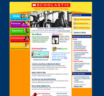
Scholastic is similar to McGraw-Hill in regards to the fact that the web team is “invisible”. After digging through numerous pages trying to decipher all the phone numbers and addresses given, there was no email listed for the webmaster. In the footer of the site, it says © 2006 by Scholastic, which leads visitors to assume the author of the site is the company Scholastic. There is no name listed for the responsibility of the site, so it can be assumed that Scholastic takes responsibility as a whole. There is no documentation on the site for individuals who have written for or contributed to the site.
Several key features cue visitors in to the company's identity, purpose, and mission.
- Their slogan beneath their name is, “Helping Children Grown, Learn, and Be Happy”
- Their choice of photos, fonts, and colors
- Their choice of a large, sans-serif font allows for easy readability
- Their choice of the rainbow – red, orange, yellow, green, blue, indigo, and purple for a color scheme.
Scholastic's website differs from McGraw-Hill's in appearance, despite having near similar goals and objectives in publishing quality textbooks for education.
Home :: Back to Top
Audience & Users
Scholastic
There are several different groups of users of this site. The primary users are administrators and teachers. The secondary users would be parents & librarians and the tertiary user group of this site would be children/kids. On this site there are obvious links meant for each type of user. On Scholastic's homepage, the left navigation bar is for the sole purpose of quick navigation for each user to find the information they need. Resources meant for librarians will not be found on the page meant for kids.
Depending on which user group a person is in, this website will be used differently. Members of all user groups will bookmark this page, since there are valuable resources in every group, but the adult users will utilize these resources far more often than will the younger users. Kids will come to the website to play games with their favorite book characters such as Maya & Miguel, Harry Potter, and Abby Hayes. Adults, no matter which user category they fit in, will use this page as a reference and a resource. Certain elements such as lesson plans will be printed out, but not the website in general.
Each section for users is tailored to their needs. The content, page layout, design, and typography are all intertwined to create the best page for the intended audience.
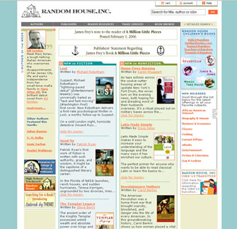
Random House
The users of this publisher's site differ significantly from those of Scholastic. Users of this site are adults who are searching for books published by Random House, since the site is an online search database. Since there is only one user group, there are no separate links or pages for different groups. The horizontal navigation bar at the top of the page give users several different option of book searching – by author, publishing division, or genre.
This site will most likely be bookmarked by its users and used for reference. It will obviously be searched, since that is the main purpose of the site. Based on the design, typography, and color scheme it was not difficult to determine the user group that this site was tailored too. Scholastic's and Random House's sites could not be any more different in regard to their users.
Home :: Back to Top
Format & Organization
Scholastic
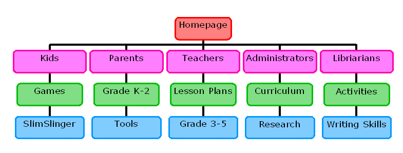
Below is an example of one of the many site maps that Scholastic's website has. Since there are numerous links in each user category – Kids, Parents, Teachers, Administration, and Librarians – the site map is enormous. This is just a sample of what is possible in each user category.
There are many elements of this site that were found in both McGraw-Hill's and Random House's sites. Each site has an “About Us” page as well as “Contact Us” page. In addition, they had a link to their privacy policy and permissions pages at the bottom of the homepage. Only Scholastic and McGraw-Hill had links to their site maps, Random House only had a detailed search link that led to a page where the site could be searched. None of them contained banner advertisements on their site. Scholastic broke convention by their vibrant colors, round box edges, and larger font size.
The structure of Scholastic's website is somewhat of a hierarchy, but it is a wide hierarchy, with each level having 5-6 options and many links to articles and information on each page. Its structure is very concrete and easily navigable to quickly find the information in the site.
It is impossible from a user's point of view to count the number of links on Scholastic's entire site. A fair assumption would be over a hundred links and six or seven levels – but each level having countless links. There is somewhat of a variety of media, there is text, flash games for kids, .pdf files available for download, and a flash banner at the top of the homepage. Overall, there is more text and picture than white space, but the use of white space is quite effective in breaking apart sections. The kids section is about 80% visuals to 20% text, which is the opposite of the librarian's page. Each section changes their text to visual ratio based upon their intended audience.
Home :: Back to Top
Level of Formality
McGraw-Hill, Random House, and Scholastic
McGraw-Hill's website is nearly identical to Random House's site in regard to their level of formality of their websites. Based on quick glances to other publishing companies' websites at this level, McGraw-Hill and Random House's level of formality appear to be the standard. Publishing companies' websites are formal, with small text, small company logo and neutral colors. Only Scholastic's website is bold and youthful. McGraw-Hill, Random House and other publishing companies have more adult users, even though they have children's divisions. Users would be more apt to spend more time on Scholastic's website than McGraw-Hill or Random House because of the informal tone of the website. It appeals to the youth, whether the user is a youth or is an adult that works with youth.
Home :: Back to Top
Use of Visuals
McGraw-Hill
This site visually supports navigation by repetition of red arrows on the main page. Links as well are in red, they stand out more than blue links. In addition, the usage of the red arrow is repeated again in their flash banner near the top of the page. The banner draws in attention which leads users to one of two areas, the site navigation bar directly above it or downward where the red arrows await to direct users to the information they desire. Different section headings are bolded to increase contrast in the text.
To break up the vertical text, McGraw-Hill uses horizontal breaks between different sections. The homepage is made of two equal columns, while subsequent pages are made of three, two narrow columns flanking a wide center column. There are many line breaks, arrows, and red colored links that appear often enough to break up the text.
There are little visual representations left on the page that have not been mentioned. Sidebars are used to direct attention to important information, updates, and newly added information. Also, there is a sidebar that contains related links for users to follow.
Scholastic
This site visually supports navigation by chunking – information is grouped together in a box or in close proximity to related topics. The choice of bold colors for the site draw user's into the site. Each section has been given a color to represent it, for example, the teachers section is green, which allows for easier navigation because the user is not required to read closely, as long as they remember green is for teachers. In each section page, there are many tables and colors that enhance navigation. There are two main visual cues that contribute to navigation – colors and photos – and they work beautifully to enhance navigation.
Scholastic's website does not uniformly break up vertical text blocks. On the kid's page, there are text bubbles that are connected by lines to draw attention to the next block. On the adult pages, there is some variation on a basic two column layout – the right column is narrow while the left is wide. Similar to McGraw-Hill's site, there are no frames.
There are not many visual representation on this site. There are a few sidebars, containing extra information. Most of the information is broken up into small text boxes so there is little need for information to be presented in different visual formats.
Home :: Back to Top
Range of Variation
McGraw-Hill, Random House & Scholastic
Summarizing the above categories, McGraw-Hill and Random House are pretty standard sites in the major book publishing industry. They use neutral colors, smaller text, and have adults as their primary users. Though they both have photos, they have significantly less photos compared to Scholastic. Scholastic is the odd one of the bunch, it does not conform to the standard plainness of publishing company websites. It is more youthful and fun to explore. It is easier to navigate and find the information a user is searching for. McGraw-Hill and Random House have mostly easy-to-navigate site, once it has been explored to its full potential.
Scholastic has chosen in every way possible to reject the industry standards on their website. It was a wise decision. There is more content, more color, obvious links, and abundant resources to help users find what they are searching for – even if the answer is not on their site. The youthful approach reinforces their mission of being a children's book publisher and reassures skeptical parents, teachers, and administrators. The site indicates that as a company they are willing to reject what is normal to fulfill their goals – leading potential authors to desire to publish with them rather than a stuffier company like McGraw-Hill or Random House.
Home :: Back to Top
Forecasting My Own Experience with this Genre
McGraw-Hill, Random House, and Scholastic
I see myself working for a publishing company in my future – at least it is what I desire to do. If I were to choose which company I would prefer to work for based upon my feelings from their websites, I would most likely pick Scholastic. The impression I receive from the site is that it is a fun place to work. I am reminded of fun times in my childhood and learning to read. I believe that education is important and the valuable resources on their website promote learning and education.
My analysis of this genre has helped me see that the more a website offers, the better the site will be. Adding color, contrast, and a youthful tone make a website more fun and there will be a greater chance of users returning to the site. Photos can be reassuring as well as break up text. In addition, increasing the font size and using a sans-serif font will make the document more likable by the users. I also think that there are no limitations on creativity and what a website can do as long as they keep in mind design principles – breaking the rules sometimes is more effective than following the rules.
Home :: Back to Top