
Writers And Developers:
*The makers of this web site are employed by Coca-Cola. They are invisible to the user because there is no section about them on the web site, and there is no credit attributed to them at the bottom of the page.
*The writers and content contributers are represented merely through the designs on the web site since there is no mention of them on the web site.
*Under the "Our Company" section of the web site, there is a "Beliefs" section with "Commitment to Quality" and "Code of Business Conduct" subsections. This explains the ethics the company believes in. There is also a "Manifesto for Growth" section which includes the mission and vision and also the values of the company under its subsections. Credibility can be found in all of the other sections under "Our Company." There are documents, reports, and awards posted to give the public an insight to what Coca-Cola is all about. The design is fun but formal. There is a lot of information available and it is put in an accessable, organized way. This tells the site's audience that care and effort was put forth when this web site was created and it obviously continues to be cared for.
Audiences and Users:
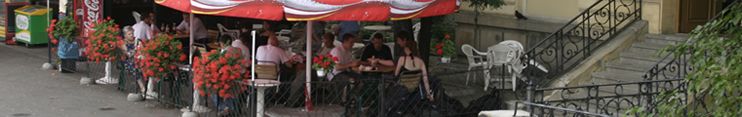
*There are many audiences for this site. The first audience that comes to mind is the public. The public can come to the Coca-Cola site and find out more about this powerful beverage company. Secondly, business partners can come to the site and get updates on what the company is doing and how it is doing. A very important public to Coca-Cola is its investors. In fact, there is an entire section of the web site just for investors. Here they have many different topics to choose from to get whatever information they want or need to know. The media is also a major public for this web site, because Coca-Cola has even included a press section with information the press can use to broadcast to the public. Lastly, potential employees are an audience of this site. There is a section for jobs available in many countries world-wide.
*This site is good for using as a reference. It lets you read whatever page you have up at the moment and it also continues to show all of the other menu items from the home page. If documents need to be printed, they are all available in a printable version. However, I think this site is mostly for searching and reading. Investors might bookmark pages to continuously check them.
Format and Organization:
*This site includes many contents that are common in web sites similar to it. There is a search field, a "contact us" section, and a navigation bar at the top so each audience can find what they are looking for. Some of the content on this site is unique. For example, it includes information specifically about the company in the United States, and also specifically about the company in other countries. It has a "Citizenship" section that outlines all of the volunteer projects Coca-Cola is working on with the public. Also, there is a "Brands" section where people can find out which brands Coca-Cola owns, and contains information on the products.
*This site was designed to provide easy navigation and as much useful information as possible for each of its audiences. It is more complicated than a simple hierarchy. The structure makes a lot of sense. For example, many of the sections on the main page are specifically for certain audiences. Each audience also has many additional options under their audience heading. For whatever purpose someone is searching the site, the site provides a wide range of options in order to cover all these various wants and needs.
*This site is made with red, gray, and black. There is no white space left, simply white text in some places, and one small white Coca-Cola bottle. The percent of text and pictures is about 50% each. The only animation takes place on the intro page where Coke bottles pop up all over the screen with the logo and four major links to the main Coca-Cola sites. When the mouse moves over the page, the Coke bottles shift. There are also bubbles that float up the page as one is looking at it. This design works because it is fun but it remains formal. This type of design caters to many different audiences. It shows character but also sophistication.
Level of Formality:
*This site is formal because it has many important audiences that aren't simply consumers. Its tone of voice is not personal but instead speaks generally with formal terms. There are many facts on the site with the appropriate sources listed next to them. The style of the web site also adds to its formality because the template is basic and readable. Nothing crazy or distracting takes place and it is very easily accessible.
Use of Visual Cues and Images:
*The site is split into main sections so the users can pick one based on what they are looking for. There is also an easy to find search area. The important words and headings on the site are in bold. Instead of bullets, the Coca-Cola site has arrows next to all the different sections under the site headings. When the mouse is moved over the separate headings, a pop-down menu for each section is shown. The site uses dynamic techniques to provide visual support. Each time the Coca-Cola page is refreshed, a different banner picture is shown. In addition, most of the main headings show a picture when they are clicked on.
*Tables are not used on this web site. However, the elements under the main headings are in two vertical columns. The main headings are in a horizontal line across the top of the site.
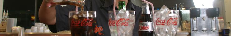
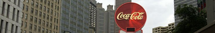
*Many different aspects of Coca-Cola's logo(s) are shown throughout the web site in various places. Other than this, soda bottle graphics are shown and many pictures can be viewed.
Range of Variation Among Representative Samples of the Genre:
*This site is typical for others of its nature. I actually prefer it better than the Pepsi site because it is less busy, more formal, and better organized. I think it rates amongst the top web sites of its nature.
Forcasting Your Own Experience with the Genre:
*The analysis of this web site helped me to see just how much work is put into a site like this one. I am planning on working for a company like this one some day, so it helped me to look at things from the producer of the web site's view rather than a consumer point of view.
Site Map