 |
The format of this website is very conventional, comparable to that of Pottery Barn. Some of the traditional design features found within the West Elm website are:
- A menu bar at the top featuring the categories of products
- A menu bar at the bottom addressing customer-service needs
- The logo in the upper left-hand corner
- A product search option in the upper right corner.
There are also a few aspects of this site that are a bit more unique and specific to this company.
- The viewer is provided with various means of navigation.
If an individual were to click "furniture" on the top menu bar, the next page displayed would be one with images representing the different furniture categories. However, if one simply places the mouse on "furniture", a pull-down menu appears listing the different furniture categories. This is an important characteristic of the website because it appeals to both visual and analytical users. Those who don't like to read will probably navigate through the use of pictures, while others will simply click on the word that represents the desired category.
- The use of type as a design element.
Almost all of the text is in lowercase, san-serif font. There are particular headings that are distinguished by the words being in all capital letters, however other than the product description, the font is almost always in lower case. This is non-traditional, but fits the site really well in that the products are unique and unconventional as well.
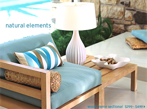
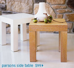
Although this is a highly structured sight, it has a very simplistic feel, again depicting the tone of West Elm itself. There is very minimal text and a lot of white space, which makes the sight very easy to navigate. The use of visuals is obviously very important for this audience, as they desire to see the products they can place in their home and the way it will transform their personal space (as depicted in the visuals). |