
Parody Site
Aside from analyzing a website genre, I also made a parody page.
Check it out!
![]()
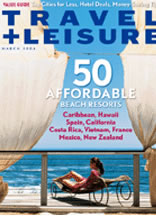
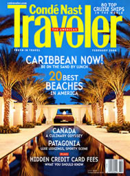
OverviewPublished travel magazines often offer a website that connects their magazine with helpful travel tools for users to navigate. For instance, they have subscription information and management for the magazine and an article archive, but they also have search tools, create a vacation tools, and more. On this page, I analyze the genre of travel magazine websites. I am specifically considering Travel+Leisure and Condé Nast Traveler magazines as examples.
|
 |
|
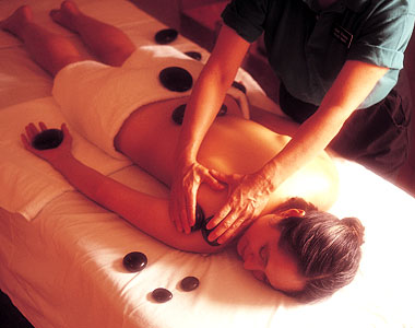
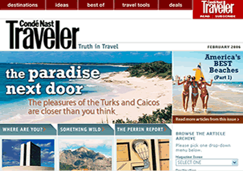
Writers & DevelopersJust as a travel magazine is written and edited by many people, so are their websites. The websites have numerous editors and even more contributing writers. There are three individuals on the editorial staff of Travel+Leisure and more than ten for Condé Nast Traveler. These people are named on the contact page of each website. Both sites also make it easy for users to email the writing teams and web developers. Writers are represented by nearly everything they have contributed because much of what they offer are articles. The travel tools found on the site do not have an author tag line, but were probably created by the editorial team for the site. In some cases the travel tools come from another site. In those cases the website gives credit and a link to the other site. It is easy to tell that author representation is important to travel magazine sites because they always give credit to the contributor. This makes sense because magazines often publish mostly freelance articles and so the same is probably true for their on-line sites. These sites want to continue to receive freelance work and so they represent their writers well. Credibility of the authors is found within the articles because it is clear that the author has traveled to the destination and heavily researched the subject they are writing about. Each website is bright and colorful with a lot of pictures of destinations and people. The travel magazine website editors understand that many people dream about traveling, but do not always do it. They want the users to enjoy the pictures and be enticed into reading more about Italy by seeing a picture of Italy. It is important users also be able to connect to the magazine. So, the editors place subscription information and links to articles that are found in the current month's magazine. |
||
 |
||
Audience & UsersThe likely users of travel magazine sites are numerous and varied. The primary users of the site are probably in the middle to upper socioeconomic classes. This is because these people can more likely afford leisure travel. The primary users are also less likely to have young children because it is often harder to travel with young children. These users are most likely to use the travel tools and site information for making actual travel plans. The secondary group of users are those that are interested in travel, but are less likely to use the tools and information for an actual trip. These users read the information for entertainment or to be informed. These users are more likely to have less money than the primary users. |
 |
|
Both sites offered paths, links, and information that would appeal to primary and secondary users. There are also areas on the site that would interest both groups. These areas might include the magazine article archives, travel tips, destination information, and more. The hotel and "hot deals" links are more geared for the primary users since they will be more likely to use the travel tools and research further into a trip than a casual user dreaming of visiting Japan one day. Polls and photo contests could appeal to both groups, but seem to be geared toward the secondary users who are being "entertained" by the site instead of "helped" by it for actual trip planning. For both types of users the travel magazine site is used to gather information about a places, prices, ideas, and other things dealing with travel. Users will search the site for useful tips on certain topics or they may search the site for further information on lodging in an area or the best restaurants a city offers. Users may print articles or price information or deals that they find on the site. This site is probably not a book-marked site because it is not used with that sort of regularity for most users. These are sites that are used as a reference tool or for entertainment.
|
 |
|
Format & OrganizationThe structure of Travel+Leisure's website is very complicated. Each page of the website has many, many links to articles, blurbs, travel tools, maps, pictures, price lists, other publications, and more. The site map below is a simple outline of a very detailed websites. Each node represents the different areas the website has and then the subsequent articles and information found within that category's pages. The nodes and links are self-explantory of the information they hold.
|
||
 |
||
The conventions of these types of sites are: advertisement banners, search fields, Destinations page, link to magazine's current issue, side advertisements, Contact page, and there are probably more. Travel+Leisure has a very extension section of promotions and advertisements that other sites do not have. These sites basically follow a fairly similar pattern though and do not have a lot of unique qualities because their audiences are very similar. The organization of the site is done in a way that users are able to reach their destination easily from the home page. There are numerous links and buttons on the home page that help the user navigate around the site. The sites seem to be structured in a logical or thought-process pattern. Each opened page has more links to additional information or more specialized information according to what interests the user as he or she goes along. This is a good way to organize the site because most users are just following links that interest them. It also makes sense for the sites to be highly organized because they have so much information. Also, some users are looking for specific information to help them, which is made easier by a well-organized site. The characteristics of the site are very complicated. Pages generally have a four- to five-column layout. The information is then broken up into small boxes or pictures, which then have links to expound on the small blurb of information. Each page has forty to fifty links to other areas of the site and other sites. The pages include mostly only images and texts, but there are a couple video links within one of the sites. There is very little white space on the home pages except toward the bottom of the page. This style of layout and design is appropriate for users because the links they need are easily accessible. Users do not need to wade through unneeded information to find links. The heavy use of images and the lack of white space are tolerable because some users are there for the entertainment of pictures rather than information. |
||
|
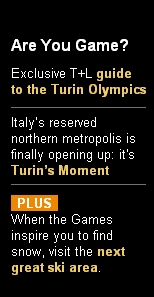
The level of formality on travel magazine websites is approximately "business casual." The site creators want the user to feel comfortable using the site and to trust the credibility of the designers. Therefore, the site is professional and accurate. The designers also want the user to enjoy being on their website, especially considering many users are visiting the site for entertainment and interest rather than need. The example to the right demonstrates this casual and entertaining quality to these sites with the header "Are You Game?" The writers mostly use the second-person voice when addressing the users. This shows a less formal approach to the writing style. The bright and numerous pictures on each page make the tone of the sites less formal and more inviting also. However, the accurate quality to the information gives the site a professional feel. The layout of the page follows clear guidelines indicating a professional quality as well. This is why the sites might be considered "business casual." |
 |
|
|
The images and visuals used throughout the sites are important because they help the users to navigate the site efficiently. This is sometimes done by including links on images that lead users to a desired area of the website, such as the magazine image leading to the subscription page. Visual are also used to help navigation. Users are accustomed to finding a search bar and a "popular links" bar at the top or right-hand side of the home page. Both analyzed sites have their links bar at the top of the page. The structure of this bar is set up to give a visual cue to the readers that it has the links that many users are looking for. As discussed in the format section, the page is has a "chunk" style layout. There are chunks of information that a user can click to link to further related information. The text styles are fairly simple since there is a heavy use of images. The sites use images with links for the most part. There are not interactive or Flash visuals on either site. These images are visual representations of information because they tell the user what sort of information the image's link might take them to. The Travel+Leisure site uses tables to organize their site while Condé Nast Traveler does not. They both use about four to five columns on each page of their site for layout. Each site also uses some frames and lines to support navigation. The use of visuals and images is key to the quality and navigability of these sites. |
 |
|
|
Travel magazine websites appear to be very similar to each other. Both sites and other similar sites have a lot of images, especially of travel destinations. They all seem to use the "chunking" style of organizing because the sites have so much information available to the user. Throughout the categories of analysis there is not a lot of variation. The only noticeable difference seems to be the amount of white space on the page and the amount of advertising throughout and on the bottom of the pages. Given there is little variation within this genre, the sites I analyzed fit right into the genre with little that sets them apart. However, they follow it well and so they are both serving their user's needs adequately.
|
 |
|
My Future with Travel Magazine Sites At some point I would like to work with magazine writing in some capacity. I love to travel and could see myself working for a travel magazine of some sort. Many magazines have websites in which they archive their magazine articles and have helpful travel tools like the sites analyzed here. I can see myself working with a sites that connects the magazine to Internet users via the web. My analysis helped me to better understand the workings and layout of travel magazine sites and magazine sites in general. Many other magazine websites are similar, such as food, city, family and other topic-related magazine sites. This knowledge could help me better understand how to obtain a job within the magazine industry by understanding their goals, at least their on-line goals. |
 |
|
![]()