| Site Map |
|---|
| Overview |
| Audiences and Users |
| Format and Organization |
| Level of Formality |
| Range of Variation |
|
|---|
|
Most of the copy that is on this website is written by columnist from the Lansing State Journal paper. Come of these columnists include John Schneider: Local, Kathleen Lavey: Local, Chris Andrews: Local, Stacey Range: Local, Vickki Dozier: Local, Janet Holoweiko: Food & Drink, Todd Schulz: Sports, Geoff Kimmerly: Sports, Mickey Hirten: Opinion, and Derek Melot: Opinion. There are other writers as well, but these are the main writers for this web page. The writting style of this particular website is informational. They use language that is suitable for the particular article. I feel that they do not use unnessary language to confuse thier readers. Many of the basic news articles are very stright forward and use simple writing to convey thier story.
|
|
The audience that the Lansing State Journal is after is mostly citizens that are from the greater Lansing area. This would include anyone that lives in Lansing or in a town close to Lansing such as: Holt, Bath, Okamas, Delta-Waverly, East Lansing, Hasselet, Mason, Eaton Rapids, Portland, Dewitt, Grand Ledge, and Williamston. The type of readers that this website is set up for is mostly yound adults and parents. This is because thier is a paper copy that people can order and have delivered to thier home every morning. the primary readers of the hard copys are the older generation. The younger generation spends more time useing thier computer and exploring the internet. Yet, both ways for reciving the news have the exaztic same articles. It is also reads smoothly that almost anyone could really use it. |
|
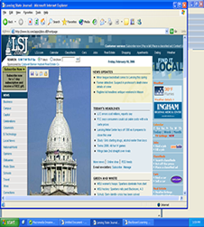
The format is set up in a way where there is a table on the left hand side with icons leading you in the directions you want to go. They have broken the table up into sections to indicate what type of news it is (such as news, sports, lifestyles, ect) then under each heading thier are subheadings that help you to narrow your search down even farthur. There are links to every article that is published. This makes it easy for the readers to skim over the headlines and pick a headline that catches thier attention. They can by pass all the articles that they are not intrested in. There also is a header at the top that has the Lansing State Journal logo in the top left corner. There is a blue heading that stays with you as you scroll there the different pages. This makes the website consistent. The pages are organized into tables creating boxes for each story that is written.
|
|
The level of formality in this website is easy to read. The tone of the website is clear and appropriate for a news website. It is easy to fallow and very clear cut in showing how to maneuver through the different pages. Compaired to other news sites this website falls into the same layout as others. They have created tables to box off each section to make it clear to the reader where the story starts and stops. They use tables to create clear connections to the differnt pages that they offer. Overall it is clear and to the point. It is also well layed out and easibly accessable.
|
|
They use a very consistence way of using visuals to stimulate a visual effect. It is not too cluttered so that you are distracted by the visuals, yet they are helpful and interesting. I also have found that the visuals help to sperate the stories apart from each other. They only part of the visuals I did not find appealing was the advertisements on the far right table. I felt that the advertisements were very cluttered and were almost distracting from the other visual aids. This is because the advertisments were flashing differnt colors and had movment, where as the other visuals were just standered images.
|
|
The range of variation compared to other news sites is not very different. It is consistence with the way that most news websites are set up. This makes the Lansing State Journal easy to use and helpful to any type of user.
|
|
As a advertising major I would be intrested in finding differnt ways to increase the advertising on thie website. I would also want to find a differnt way to advertise instead of using flashings of differnt colors and moving objects to obtain people's attention. I would also want to find a way for the advertisements to nott look as cluttered.
|