OverviewThe genre that I chose to analyze was Catholic Parish websites in the Grand Rapids Diocese. In this particular genre the main goal of these websites are to provide a warm and welcoming environment along with information to all their users. Some of the Catholic Parish websites that I researched in order to get a full perspective of this genre included: St. Michael's Parish Website, Saint Patrick Catholic Parish Website, and St. Mary's Catholic Parish of Spring Lake Website. However the site that I chose to extensively research and analyze was the Holy Redeemer Parish Website.
|
||||||
Writers and DevelopersRegardless of the genre, websites can have many different authors. The author of the Holy Redeemer website is the church itself. Like most church websites, there isn't one particular person that provides information to the site, but the members of the production team are not visible, meaning their names are not listed on the site. However, since it is a church organization it is likely that there isn't a high budget production team. As I was researching this genre, I learned that some Catholic Parishes have their websites hosted by a larger web-hosting company such as Catholic Online. However, there is no evidence that the Holy Redeemer site is hosted by a web-hosting company. Thus, church staff is probably responsible for the website's content and design. Some of the features on the site that cue the users into who has written the site are the copyright statement at the bottom of the website, which indicates that the church is responsible for the information services provided on the website. Also, subheads such as community, education, mass schedules, sacraments, etc. help the users of the website clearly understand the mission of the website and its purpose. The writers want to help their users find information and they have written material on this page to help inform their user groups. The design of the Holy Redeemer website is a professional and classic design. This signals to the readers that this is a credible website and that its content can be trusted. Also, in terms of credibility the writers have displayed the copyright at the bottom of the page showing their users that this information belongs to them and is in deed credible. Lastly, the site can be viewed as credible because it is a site with an 'org' domain name. This shows that this is an organization website and the information on the website is trustworthy for the users.
|
||||||
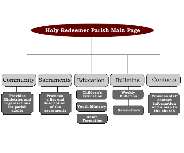
Audiences and UsersThe primary users of this site are members of the Holy Redeemer Catholic Church. The members using this site can range from 14-80 year-old individuals of both genders. Also, the members using this site can range in social status so the site has to be able to appeal to a wide range of users. The main purpose Holy Redeemer members will use this site is as a source of reference. There are the sections, such as bulletins, contact information, and community, to provide a source of information to members when they are in need. This website will most likely be bookmarked by the church members and visited periodically to catch up on the latest announcements if they have missed mass. Also, the site will probably not be printed out as a whole, but the church members might print out the bulletins, mass times, or special events. Obvious Links for Church Members On this website there are obvious links that are intended for the church members to use. Some of these links include:
The secondary users of this site are prospective church members. Prospective church members will use this site as a source of reference in deciding if this church is right for them and their family. Again, these prospective members can range in age, gender, and social status so the website must be appealing to a wide variety of users. The prospective members may bookmark this site if they are interested in joining the church or they may just review it as a starting point to finding a church. This website offers vital information for prospective users and gives them a sense of what the church is all about when using it. Providing sections such as education, sacraments, and contact provides prospective members with the information they will need to make an educated decision if the church is right for them. Obvious Links for Prospective Church Members
Members from Different Catholic Churches Other church members may use this site for a comparison to their own site, or look to see when upcoming events in another church are, again using the site as a standard of reference. Sometimes there are events that are happening in different churches so even people who are not members of Holy Redeemer, but members elsewhere can use the site as a point of reference in learning about events, especially through the bulletin section.
|
||||||
Format and Organization
Some of the conventions (similar items related to this genre) include:
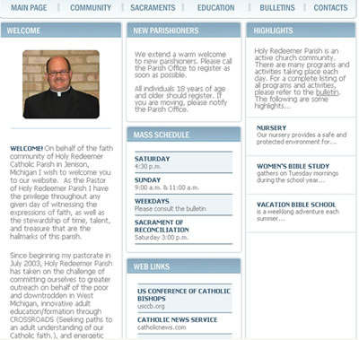
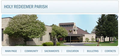
The homepage of the Holy Redeemer website is organized very nicely. The organization is very logical and clear. Each heading and link tells the user exactly where they are going and what information they are going to find when they get there. This logical structure makes sense in terms of the church's audience because they want the information to be clear and easy to access for their members and even individuals who have never been to their site. The overall structure of this site provides a comforting and positive experience for the user. One of the characteristics that stands out right away is the banner with the church picture. This banner draws the user into the page and provides a clear visual hierarchy for the user. Also, this image is repeated throughout all the pages so it provides a sense of consistency for the user. Aside from the banner there are the clear subheads that serve as the secondary vocal point in the visual hierarchy. These subheads and link tabs provide information to the user and it shows the user up front what kind of information this site has to offer. Another visual interest on this page is the choice of colors. The primary color used on the site is a light blue color, which provides a calm and relaxing environment for the user. This claming effect is likely to make the user stay on the site longer rather than getting frustrated because of an intense color or image. Also there is plenty of white space surrounding the text making the site more calming as well. Lastly, there are many different links on this site. Initially there are only the six different link categories at the top of the homepage, but within each of these pages there are links to contacts, anchored links to different sections on the page, and links back to other section of the site.
|
||||||
Level of FormalityWhen writing a website for a church, the formality level should be fairly high since most Catholic Church websites are a representation of the church it self. Most of the Catholic Parish websites do have a high level of formality because they are trying to express their morals through this level of formality. The first sign of formality is through the graphics and colors on this website, which provide an overall professional feel. The tone of the website is formal, but casual at the same time. It has a little more causal tone in terms of using "you" in sentences to let the user know the information is geared toward them. Also, for the most part the Holy Redeemer site has done a good job at using linguistics correctly with only a few minor grammatical errors in the sentence level. Most of the language is tailored toward members of the church or perspective members and the language has an overall positive feel.
|
||||||
Use of VisualsWithin any website visuals are key in making the user's web experience more positive. The Holy Redeemer website visually supports user tasks such as navigation through their use of a grid system that allows users to follow links easily. The grid system this site uses is set up in vertical columns on the main page and the contact page, but the structure switches to horizontal columns in the community, education, and sacrament sections. Also this site uses headings and chunks, banners, various text styles, bullets, and color to provide easy navigation and an overall positive experience to their users. The use of the visuals is subtle and they aren’t dynamic or interactive, but that would play against the formal and calming tone the site has overall. Example One: Headings and Chunking On the website's homepage there are clear headings that are linked to their corresponding pages. Also there is a good use of proximity on this page, grouping like information such as mass schedules, highlights, and web links so that the user can find information easily. This chunking of like information creates less confusion for the user and it makes the website more effective and informative. In the picture below you can see the use of headings and chunking.
Example Two: Banners On this website there is a banner which houses the picture of the church. This banner appears on every page creating a sense of unity throughout the website. This use of repetition allows the user of the website to clearly identify what site they are on even though they have clicked many links. This makes the site more professional looking and provides the user with a sense of comfort, eliminating confusion.
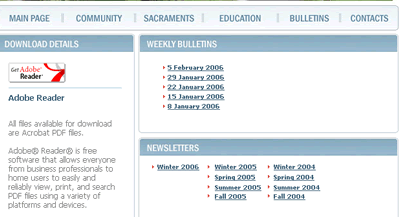
Example Three: Text Styles, Bullets, and Color The text of the majority of the website is done in a sans serif font and a light gray color. This might be a little hard for the user to read in an area that isn't very well lit, but for the most part it alludes to the overall calming and inviting feel the church is portraying throughout the site. The subheads throughout the site are done in a bolded blue font, which is a clear contrast against the body copy. This provides the user with some visual contrast and makes the page inviting. As you can see the use of bullets for the dates of the bulletins allows the user to find information easily and quickly. These bullets also provide a visual interest to the user and they reduce the text giving the user's eye a place to rest.
|
||||||
Range of VariationThe Holy Redeemer Catholic website is a very typical web site of the genre that I have chosen. In the majority of this genre all the websites have similar subheads (bulletins, contact, and mass times) and graphics (a picture of the church). From what I can tell there isn't too much variation in this genre of websites as far as content, but of course each site has its own style of individuality in design. Each site uses different colors and text styles. Also some sites have more graphics and images and some sites have more animation and media. Some of the areas that have variation include: Format and Organization: Here each website in this genre has its own format. For example there are different alignments Given these variations I would give the Holy Redeemer Catholic Parish site a high rating. This particular site uses the conventions that are found on other parish websites, especially the links such as bulletins, staff, contact, and education. Writers and Developers: Some of the websites are hosted by a web-hosting company and some of the sites have a webmaster which can be contacted directly. Other Catholic Parish Websites:
|
||||||
Forecasting My Own Experience with this GenreAs a professional writing major I hope to pursue a career in web writing or wed design after I graduate. However, I don't particularly want to work for a major corporatation. Instead I would like to focus more on non-profit organizations, or more specifically working at a local church as their web editor. Thus, since I am hoping to work in a church this genre was important for me to analyze. From analyzing this genre and looking at different Catholic Parish websites I was able to gain some beneficial information that will certainly help me in my future career. One important thing that I learned was the "normal" content for Parish websites. These conventions included: bulletins, contact, education, sacraments, and web links. Knowing the typical information that is found on the Catholic Parish websites will help me in the future because I will know a little bit about what users want and use. Also, this analysis helped me in learning about how much formality should be in the writing and what layouts to use in order to turn a church website into an effective and intriguing site for various users.
|