Projects: Assignments:
Outside Links: |
|---|
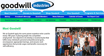
Web Structure, Content, & Interface DesignWeb Stucture and Content: The structure of the Goodwill sight is no easy feature to describe because there are a large number of pages. I believe that the original Goodwill site did well in forming the five main categories: Meet Goodwill, Donate Goodwill, Shop Goodwill, Hire Goodwill, and Programs and Services. These headings all appeared clear, therefore, the biggest challenge was working with the subcategories. When clicking on Meet Goodwill, one will be able to view a brief history of Goodwill, the president’s message, board members, news releases, events, and an annual report card. Under Donate Goodwill, visitors can find out what to donate, where to drop off donations, how to schedule home pick-ups, how to make online contributions, and how tax deductions apply. In the Shop Goodwill tab, users can find the twelve store locations and read the coffee bar menu and prices, as well as click on the link that takes them to Goodwill’s online store. In Hire Goodwill, businesses can read up on the variety of workers that Goodwill provides, and the different services that businesses may be interested in, such as outsourcing or hiring work crews. Under Programs and Services, those looking to seek help from Goodwill in finding a job can read about their core services, the different training programs and employability workshops, as well as the private rehabilitation. While various pages may have different contact numbers, there will still be a Contact link where there is a webmaster to email and a summary of the contact numbers and emails for each main category. The reason I put a summary of all the important numbers and emails on that page was so that users would not have to search the whole site for certain contact information. Now it is all on one page for them. In addition to a contact page, there will be pages outlining a couple volunteer opportunities and different ways to support Goodwill, as well as locations and related links. This information will be available on every page, only a click away. The content of the goodwill site has thus far remained largely the same, however, I did rearrange a few things, including text and graphic placement, and I eliminated a couple subcategories because they were unnecessary or repetitive. Each main category has an opening page with a small paragraph and a picture to introduce the category. Because the Goodwill website is vague in describing some areas, this did involve some research, but I think it is effective. Some of the text I rewrote slightly and added some “you” in there to make the website feel less formal in some areas.
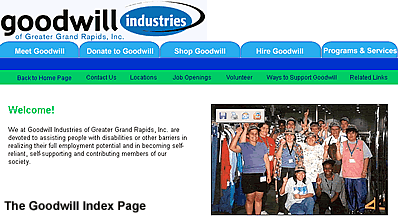
There is still some area that requires work. Some of the pages, such as the Private Rehabilitation page, which lists various rehab options, need some work on the one-liners describing each option. Other than some tightening of the language and sentences, most of the writing remains the same. Interface Design:When opening the Goodwill website, the initial design you see is the same design you will see on the following pages. There are five tabs listing the main categories across the top of the page in a light blue, under the Goodwill logo. Under the tabs is a darker blue line that is blank on the home page; however, if you click on “Meet Goodwill” the tab will turn dark blue to match the line underneath and the line will contain all the subcategories under “Meet Goodwill,” and those subcategories will remain on all the pages under that tab. Under the blue line is a green line that contains the following links: Back to Home Page, Contact Us, Locations, Job Openings, Volunteer, Ways to Support Goodwill, and Related Links. These links will be on every page, including the home page (with the exception of the Back to Home Page link).
I decided on the tab style of navigation because it is clear, unlike the pop-up menus they were using on the original site. After clicking on a tab, one will be able to constantly view all the other subcategories under that tab and keep track of which tab they are in. In addition, by eliminating the chaotic pop-up menus, visitors won’t accidentally click on something and lose track of where they are. I put the links in the green line on all the pages as a convenience for the visitors. While on any page, the users may easily find locations or contact numbers without having to search the site. Development InformationTo keep the content, interface, and graphics consistent, there are a few things a group would need to know. First of all, the color scheme consists of two shades of blue and a green: the tabs appear in light blue (unless selected), the line below the tabs in dark blue (and the selected tab), a green line below that with general and convenient links that appear on every page, and first and secondary headings in green. The logo is the same as on the original site, but is tightly in the top left corning, reducing the amount of space in the heading, and increasing the amount of body space. Directly beneath that are the tabs and links. The index page is saved as goodwillindex.htm, and on that page, and the opening page under each of the five main categories there is a small paragraph introducing the category and a picture that fits with the category. Most of these are from the original site, but here are a few new ones sent through email from Goodwill. Any group members would need to make sure they had access to the graphics. This website will probably be hosted on the Grand Valley State University website in my public_html folder; however, if Goodwill decides to use it, then it will have to be transferred to whatever server Goodwill Industries is using. In that case, the easiest way would be to get their server information and use FTP to transfer it.
Web Promotion and MaintenanceIn order for users to locate the Goodwill website, I inserted meta-properties. I used keyword and description head tags. Some of the keywords I used were: Goodwill Industries, Goodwill, donate, donations, and disability aid. The description head tag was as follows: Welcome to Goodwill Industries of Greater Grand Rapids where our goal is to help those with disabilities or other barriers in learning job skills and acquiring employment. At our website, you can find information on donating, shopping, hiring, and training. Using these meta-properties, people will be able to find the Goodwill website. I do have one suggestion for advertising, if they aren't already doing it. In the last five years or so, weblogs have become a huge thing. Goodwill might consider advertising their website on a blog; however, they would have to do research and make sure that they choose the right kind of weblog and target the right audience. If Goodwill decides to use this site, it will be up to them to maintain it. Because they have a page on News Releases and a Calendar of Events page, they will have to update it fairly frequently in order to keep it useful. This could mean updating it every week depending on how many new releases they have or how many events, or it could be as little as once a month. In addition, they would probably be smart in checking all the contact information every few months to make sure it is up-to-date. It is important that people be able to contact them. If their contact information is old, it reflects badly on them. Other than those few things, this site does not require a lot of maintenance. |