Parody Page: Charm Magazine
GENRE ANALYSIS WEBPAGE |
|
Parody Page: Charm Magazine
|
|
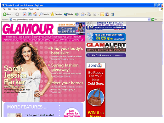
The "author" of Glamour.com is CondéNet, a part of CondéNast company. It seems that this company takes the magazine’s contents and makes them into a web page. The production team is invisible to the readers of the site. None of the web content is credited to any one person, which may be because most of it is from the magazine. The only visible crediting is the CondéNet credit and the copyright on the bottom. To clue us in to the purpose, identity, and mission, at the top of the site it says GLAMOUR in big letters, the word "subscribe", mentions of "issues", and headings for different sections of the magazine. There’s links to articles, ads, and lots of offers of subscriptions. From this we know right away that this is a site for a print magazine. For credibility, the media kit is prominently displayed. There’s a picture of a very famous celebrity centered on the page, and at the bottom there’s links to all the different magazines the company does. Also, throughout the articles, there are references to experts from whom the authors get their information. The articles take precedent over most everything because they have the biggest font, and the repetition of “Subscribe” shows that it's important to the site. The light colors and content matter also show that this is a site for entertainment, and nothing too deep and heavy. |
|
The likely users of the site are women between the ages of 18-35, who are upper-middle class and interested in fashion. They would be the primary user group, while secondary groups might be men interested in fashion, men looking for advice about women, women interested in the smaller sections of the magazine like health or sex, or girls under the age of 18 who may fit the demographic someday. The links pretty much appeal to all groups, although the different sections of the magazine are separated so that people who have different interests could go straight to their section of choice. This site could most likely be bookmarked and used as a reference. Users can use the site to preview the next month’s issue or quickly look up health and beauty advice. The organization-by-section format seems to enable those with different interests to quickly and easily skim the site and especially benefits those people who may not have the time to spend a long time looking for things. It’s also very easy to subscribe to the magazine through the site. |
|
A diagram of the site is available here, but unfortunately the font is small and some features are only mentioned because of the sheer number of nodes and links Most magazine sites seem to have prominent banner ads, are subdivided by magazine section, feature the current cover model on the home page, make subscribing online obvious and easy, have an easy way to contact the editors, and feature stories. At the bottom of Glamour, they list the other magazines that the company owns and publishes and you can go to those sites quickly and easily via a drop-down menu. Glamour also has a “More Features” section that appears on the bottom of every page so there is consistency between the pages. The site of this magazine is designed to be as much like the magazine as possible. It includes the same articles and is divided in the same way. It’s perfect for the magazine’s readers who are already comfortable with the magazine, while at the same time it is easy for new readers to use the site as well. The site is a bit long (scrolling down is necessary to get to any info) and it’s left-aligned. There are 29 different links to different areas of the site just on the homepage, and three to ads. Each node contains an article or activity for the reader. Within each section there are links to articles so it’s the articles that are the endgame. There is no sound or animation. It’s very much like a magazine. The text layout is very similar to print layout and easy to read. It’s primarily left-aligned with space on the right for some links and ads, which I feel is an amateurish and unoriginal layout. It has about 75% text to 25% white space – there is just enough white space to make the page comfortable to read. Since it reads very much like a magazine, its objective is clear. It allows for easy viewing of the articles that its audience wants to read, and some colors and pictures to brighten things up. |
|
There seems to be just enough formality to show that the magazine uses credible sources but it’s still primarily a beauty and entertainment site that isn’t too formal. The tone of voice is knowledgeable without coming across as snobby, the colors are pleasant and the layout is easy to navigate through. The articles use doctors, psychiatrists and other experts to show readers that there is some logic behind what they are suggesting. Since it’s a magazine, which focuses on writing, there are little to no grammatical and reading errors. The page layout is a little simple and ordinary, with nothing pushing any boundaries or being particularly eye-catching. |
|
The navigation bar at the top is straightforward and easy to find. All links to articles and other nodes are in a bigger font than the rest so it is easy to spot. The articles are primarily in a serif font and other special links are in a sans serif font, and the articles vs the other things to do on the site are grouped so you know which ones are which. The articles/activities that the site wants to emphasize are bigger, a different font color, and grouped together. There is nothing too dynamic about the site, it’s a very straightforward magazine site. The bulk of the site is in one vertical column that is divided into sections. It seems as though tables are the way the site is divided to organize the information, and it uses frames. The information appears in the form of the average magazine article. It’s left-aligned, divided into short paragraphs. |
|
This site is very typical of its kind. It’s laid out just like the magazine in a simple format and organization. Some sites in the same genre are more creative in their color usage or how they arrange the visuals. The other sites are similar in that they target the magazine’s key demographic. I would say this site is a little below average because it is pleasant, easy, and straightforward, but it could be a little more creative. The only deviation from accepted web standards that I can see is that simple layout to the left, and the strong ads on the top right. It looks almost amateurish and I think is just a bad decision. I think that it’s not a big deal though since for the most part the site achieves its purpose. |